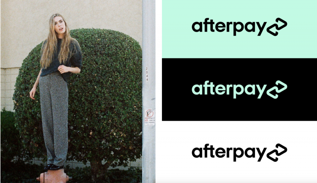
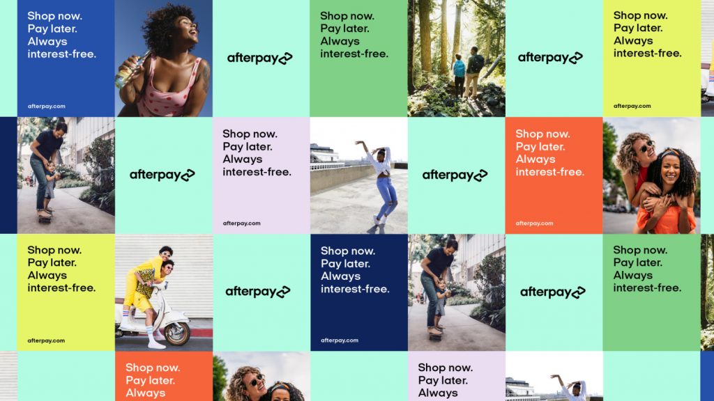
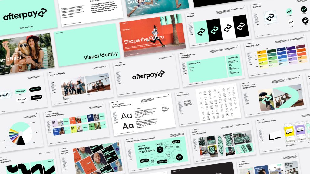
Afterpay’s new identity was developed as a resolute evolution of the brand and its services to unite the messaging across multiple regions and demographics. YummyColours reimagined the two arrows prominent in the original logo design into a linked, continuous form that evokes balance and interconnectedness. The resulting logo represents how the relationships between Afterpay, their partner merchants and customers are continually strengthened each time they interact with one another.

The interconnected brand mark expresses how we act as a link between the company, merchants, and customers. This loop represents the way the relationship among all parties is continually strengthened each time they interact with one another.

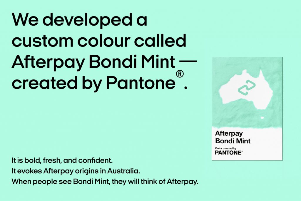
We have had a custom new signature color for Afterpay in collaboration with Pantone: Afterpay Bondi Mint.
“Color is one of the easiest and most effective ways to highlight to a consumer the unique qualities and promise behind the brand, because the color a brand chooses to present themselves is the most tangible representation of who they are. Bondi Mint boldly anchors Afterpay’s visual language, distinguishing the brand within the landscape of Buy Now Pay Later companies, and rooting it in youthful, forward-thinking Australian culture with human connection at the core.” Laurie Pressman, VP at Pantone Color Institute

Read the full brand case study here.


